A deep dive into WeWork’s member network app
by Benjamin Alderoty
There are over 200 coworking spaces in New York City alone, with new ones seemingly popping up every week. WeWork, with nearly fifty locations in NYC, has convinced investors it is different than the rest. The clearest example of this difference lies in WeWork’s global network of 150K+ members.
What follows here is a critical analysis of WeWork’s Member Network app, which is the digital infrastructure that aims to connect members within the network.
The WeWork App lets members tap into the entire community of creators and entrepreneurs. Discuss ideas, find or list opportunities, book conference rooms, workspace, and more. Stay connected and stay productive anytime, anywhere.
— WeWork Description in the App Store.
Feature 1: Home
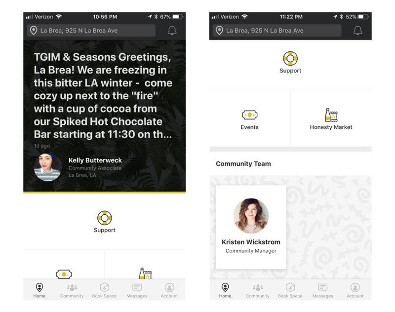
Upon opening the app, users land on the Home tab
The Home tab prominently features daily announcements from your building’s community manager. Here, Kelly is inviting the building for hot chocolate by the fire at 11:30. Right away, we’re met with an example of how the app is used to build a community within a given WeWork location. Additionally, users can submit support requests, register guests (not pictured), view events, make purchases on the honesty market and get in touch with their community manager.
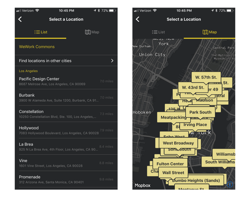
Selecting a WeWork location from the Home tab, in list and map view
From the Home tab, users can navigate between the 354 global WeWork locations through a List or Map view. Traditionally, the majority of users select a location only once. However, a growing percentage of users are opting for more flexible plans that allow users to work out of different WeWork locations. Just this past year, Microsoft signed a deal with WeWork that allows 300 of their NYC employees to work in this manner.
“When someone on our sales team is down at the bottom of Manhattan meeting with someone in the finance sector, then they can just use WeWork Charging Bull. In that space, they can have a meeting, have a coffee, relax, or whatever. Then when they have to meet with a customer uptown, they can switch to one of the other WeWork locations.”
— Microsoft’s Matt Donovan
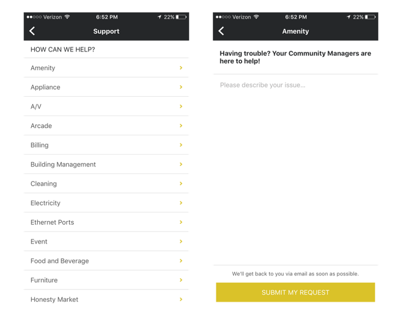
Requesting support from the Home tab
Also from the Home tab, users can request support. To do so, a user must select one of the 30 types of issues, describe the issue, and then submit it to the community manager. Once submitted, the support request is managed outside of the app, via email.
Overall, I feel the Home tab does a sufficient job in allowing users to interact with a WeWork location. The community announcement is a welcoming, daily nudge to participate in things WeWork has to offer. I’ve also heard great things about the experience around registering guests, though I’m unable to access this functionality as a limited member. Still, I can’t help but to think more could exist here. As a typical user working out of a single location on an average day, the Home tab becomes useless the moment I finish reading the daily announcement. To me, users should open the app to feed of information. In this feed, the daily announcement should be prominently displayed at the top, but mixed in with upcoming events and other posts from the community. Lastly, I feel that support requests should be resolved via in-app messaging and not email. Its odd to me that you initiate the support request from one place, but then manage it elsewhere.
Home Feature Rating: ★★★☆☆
Feature 2: Community
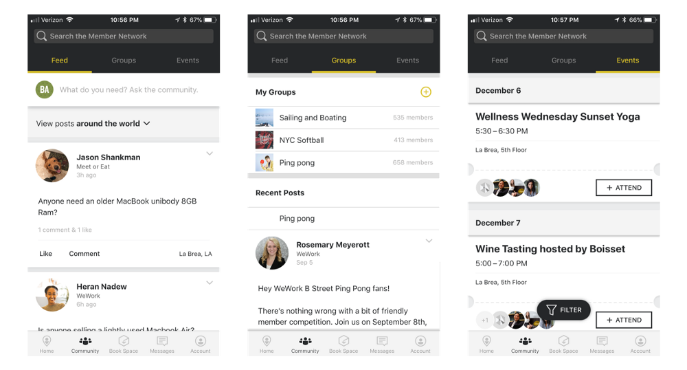
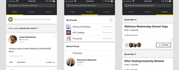
Exploring content, groups and events from the Community tab
The Community tab serves as the hub for WeWork’s 150K+ global member network. Revamping your website and in need of some help? Post here to find a member who’s done so recently. Struggling with the inner workings of FaceBook Ad Manager? Use the community to get connected with a more proficient member nearby. This is the world WeWork paints in its marketing. In search of this world, I was met with disappointment.
Within the Community tab, posts are displayed in a Feed view and can be filtered by Around the World, My City, or My Building. When scrolling through the feed for My Building, I was met with irrelevant posts displayed in no particular order. The fourth post I read was from March of 2017, while the seventh post was dated an entire year before that. Switching to the My City and Around the World filters resulted in considerably more action. However, the majority of these posts leaned towards self promotion instead of the ideas and opportunities WeWork promised. The posts themselves are very simple, composed of plain text with the occasional image attached. Outside of the main Feed view there are two additional views for Groups and Events.
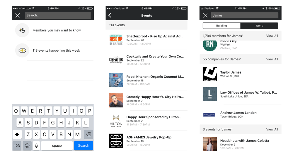
Searching WeWork’s global member network
From the Community tab, users can search members, companies, events and posts. With an already 150K+ member network growing larger and more diverse everyday, search is an important feature to sort through the noise. The empty search screen guides me to find members I may want to know and upcoming events (for the third time). I tested search in attempting to look for a friend of mine, and fellow WeWork member, James Knopf. First, I executed the search after typing in just ‘James’. The results were 1,794 James’ existing within the network and 58 companies with James in their name. Adding his last name ‘Knopf’ and executing the search for a second time, I was able to locate my friend and send him a message. Search results default to searching the global network, but can be filtered to those from one’s building (filtering by city is notably absent).
All-in-all, I had higher anticipations for the Community tab than what I was met with. Why make me navigate between three tabs? How different is an event, from a post in the Feed view, from a post in the Groups view? They are all just cards of content. WeWork should put them in a single feed where users can scroll endlessly. The feed should combine general posts, group posts, and upcoming events. LinkedIn’s feed is a great example of this, combining posts, recommended people to follow, job opportunities, and network updates in a single feed. At a deeper level, the posts themselves need to be of higher quality for me to find this feed valuable. WeWork must understand its users, what they do, and the tools they use to accomplish their work. Armed with this information, they must serve up community content that users are interested in and can engage with. Without this, the Feed will continue to serve up posts to “BUY MY $HIT” and fail to every foster a true community.
Community Feature Rating: ★★☆☆☆
Feature 3: Book Space
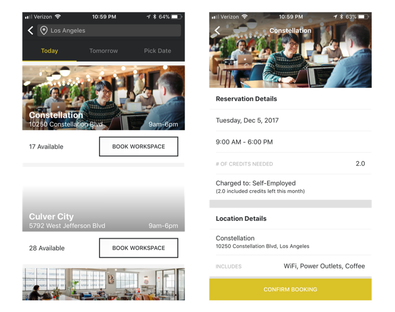
Booking a workspace from the Book Space tab
The Book Space tab is the WeWork app at its best. Upon clicking on the tab, the user is met with large conference room cards featuring an image, features, the number of seats, and a calendar of availability. As I navigate the calendar to book a conference room for the afternoon, I notice all of the other conference rooms live update. The resulting experience is powerful as it allows me to quickly scan five rooms for 3pm availability without having to tap into each room. As a user, I’m able to browse conference rooms by Today, Tomorrow, or a custom date.
From the Book Space tab, users can tap ‘Book Workspace’ to do just that. Users browse workspaces in a similar way to conference rooms, with two key differences. First, the inventory changes from just conference rooms in my building to workspaces throughout my city. Secondly, instead of an hourly calendar, a count of how many spots are still available at that location is displayed.
Booking conference rooms and workspacs through the Book Space tab is simple and powerful. The first time I explored different availability on a conference room’s calendar and saw the subsequent rooms live update, a smirk broke out on my face. My critiques in this tab are minor in comparison to the larger cases I’ve already made for overhauls of the Home and Community tabs. When tapping on the Book Space tab any day after 6pm, it should default to the Tomorrow view instead of the Today view. Since conference rooms can only be booked during 9am-6pm business hours, the user is incapable of booking a conference room for today after 6pm. Thus, it’d be a smarter default to land users on the Tomorrow view when opening the app at these times. Additionally, a user’s credits should be made more visible throughout the Book Space tab. I can imagine a scenario where a user picks a date and a time, finds the perfect conference room, and attempts to book it, only to realize they’re out of credits. The Book Space tab should make users aware of how many credits they have remaining up front and allow them to purchase more if needed. Lastly, the workspaces are un-searchable and can’t be found in a Map view like other location pickers throughout the app.
Book Space Feature Rating: ★★★★☆
Feature 4: Messages
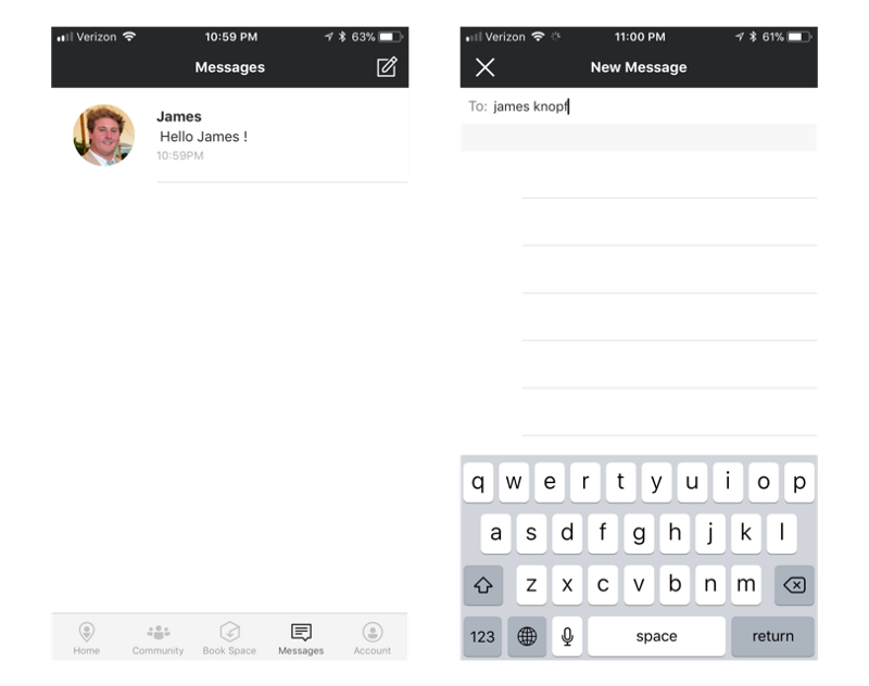
The Messages tab
The Messages tab provides a home for message threads a user has with other WeWork members. Here you can see I have one thread of messages with my friend James whom I messaged earlier. Before I messaged James, this screen was completely empty. When I tried to compose a new message, the ‘To’ field was useless in finding James’ within the network. Tapping ‘Return’ did nothing. The only way to message James was to head back to the Community tab, do a search there, tap on James’ profile, and click ‘Message’.
The Messages tab is extremely barebones and could use some love. Instead of a blank screen for new users, an automated welcome message from the community manager should be sitting in one’s inbox. This would initiate an important line of communication, while simultaneously onboarding the user into the Messages tab. When I tap ‘To’ to compose a message, the empty state should display a list of members I follow or interact with regularly. As I type, the list should search the global community of members as exists in the Community tab search. Don’t make me go elsewhere to initiate a message.
Message Feature Rating: ★☆☆☆☆
Feature 5: Account
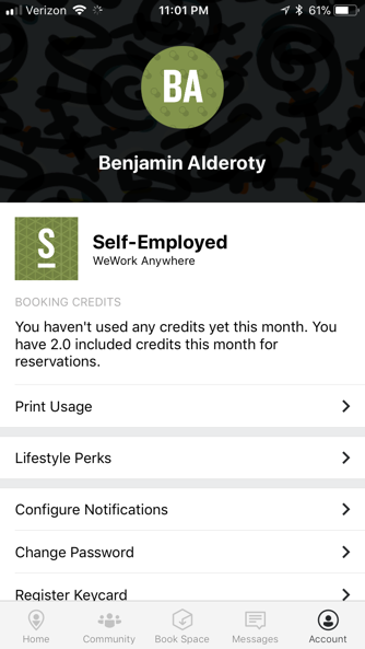
The Account Tab
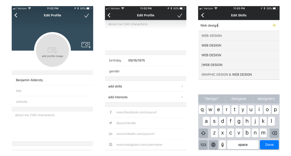
My sparse profile and my attempts to add a skill
The Account tab plays home to a hodgepodge of account information, settings, and additional WeWork features. For instance, a user can update app preferences such as changing their password and configuring their notifications. Additionally, a user can view their remaining booking credits, register a keycard, and get set up for printing.
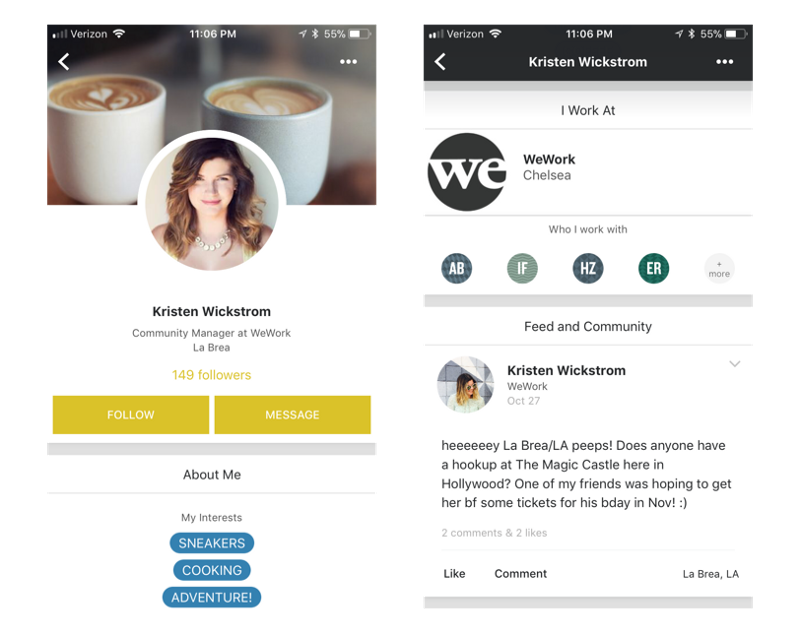
A complete profile
Within the Account tab, a user can complete their own profile. For the most part the information is pretty standard (name, company, and job title), with a few fields appealing more towards techies (website and Twitter handle). An important thing to note is that users can identify their skills and interests.
Unsurprisingly, a profile looks much better with complete information. Here we can see the profile of a community manager for a location in Hollywood. Within Kristen’s profile a user can see where she works, whom she works with, her interests, and posts. Once engaged, a user can choose to ‘Follow’ or ‘Message’ Kristen.
The Account tab and the profile that lives within it are fundamental in WeWork’s promise to connect the global community. With this importance in mind, I again had high expectations that were not met. For one, the experience around adding skills and interests is abysmal. In attempting to add the skill ‘Web Design’ I was met with a five variations of the skill that already existed and the sixth option to add ‘Web Design’ as a new skill. What became evident is the mess that is the database of skills. Some pitfalls in the architecture are the allowing of duplicate skill creation and the storing of unique labels based on case sensitivity, dashes, extra spaces, etc. The result of this is that if one user adds the skill ‘Web Design’, while another adds ‘Web design’, WeWork would would be unable to know the two users share the same skill. From the database it would show one user has the skill id=327912, while the other has the skill id=134148. The standardization of the skills database (likely interests and job title too) will not be easy, but is necessary precursor to a future community feed surfacing relevant content for its members. Also, I find general interests, such as sneakers and adventure, to be much less important in a professional setting than proficiency in tools such as JIRA, Squarespace, or Salesforce.
Account Feature Rating: ★★☆☆☆
Closing Thoughts
Looking back at the initial promises WeWork makes to its users in the App Store, I feel that they do an adequate job in fulfilling them. While I was extremely impressed with the functionality to book spaces and register guests, I was equally unimpressed with the global community of irrelevant, self promoting posts.
Below is a summary of the various ideas for improvements I’ve thrown around in this deep dive…
- Kill the Home view and land users in the Community tab.
- To do so, move selecting a location, registering guests, requesting support, and the honesty market into the Account tab. Move the daily announcements into the Community tab and the community manager to the Messages tab.
- Connect the location selection experience to the devices Location Services for faster selection.
- Allow photos to be attached to support requests.
- Support requests should initiate a message thread between the community manager and the user (instead of email).
- Consolidate the Community tab into a single feed that encompasses daily announcements, general posts, group posts, and upcoming events.
- Allow users to create different types of posts such as an update or a request for help. These posts should have unique form fields that display more sharply in the UI.
- Allow users to tag interests, skills, and tools to posts.
- Allow users to explore the companies and members in my building.
- Default the Book Space tab view to be Tomorrow if its between 6pm-midnight.
- Make credits more visible on the Book Space tab and allow users to buy additional credits from here.
- Surface the community manager in the Messages tab as a prominent person.
- Create standard lists of job title’s, interests, skills, and tools that users can identify with across the world.
- If a user has an empty profile, engage them to fill it out through notifications, gamification, and one-off nudges in the feed.
Overall App Rating: ★★★☆☆
Note: I’m currently working on building out some of these ideas into more tangible concepts and will return here with an update.
Editor’s note: A version of this article originally appeared on Medium.